


Eco Shopper Site + App
Role
UI/UX Designer App UI Designer
Team
Amanda Wazbinski, Anthony Rodriguez, Kelli Bledose, Nicholas Lepe, Ricardo McFarlane
Duration
2 weeks
Tools Used:


Overview
We aimed to design an eco-friendly e-commerce app and website that connects conscious consumers with sustainable products. We wanted to create a modern, user-friendly experience that makes it easier for people to discover and shop for items that align with their values. The focus was on simplifying navigation, improving product discovery, and making the overall journey feel intuitive and enjoyable, while keeping sustainability at the heart of the design.
The Problem
Users often struggle with commerce apps to identify sustainable clothing options and face challenges with complicated checkout processes and ineffective filtering systems.
The Solution
Develop an app that filters brands, store locations, and specific items, making it easier for shoppers to discover and purchase sustainable fashion for their wardrobes.
Design Process
Creating a proto-persona was the first step in gauging what users might like and dislike on an e-commerce site.
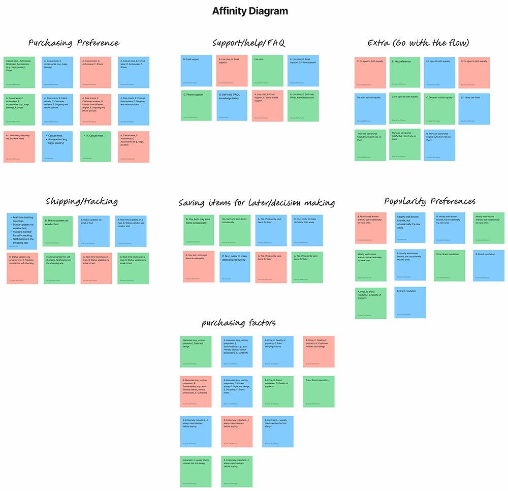
Affinity Mapping Summary
We used survey responses from a Google Form to identify patterns in user behavior and needs. Through affinity diagramming, we grouped insights into key UX themes—like purchasing habits, decision-making tools, social proof, and support expectations. This helped guide our IA and feature prioritization for the Eco Shopper app. Clusters revealed opportunities for clearer shipping UI, stronger help content, and enhanced personalization. This method allowed us to translate raw feedback into actionable design strategies efficiently.
The questions and answers can be viewed here: Interview Question + Answers. The interviews were unmoderated; the questions were answered using Google Forms.

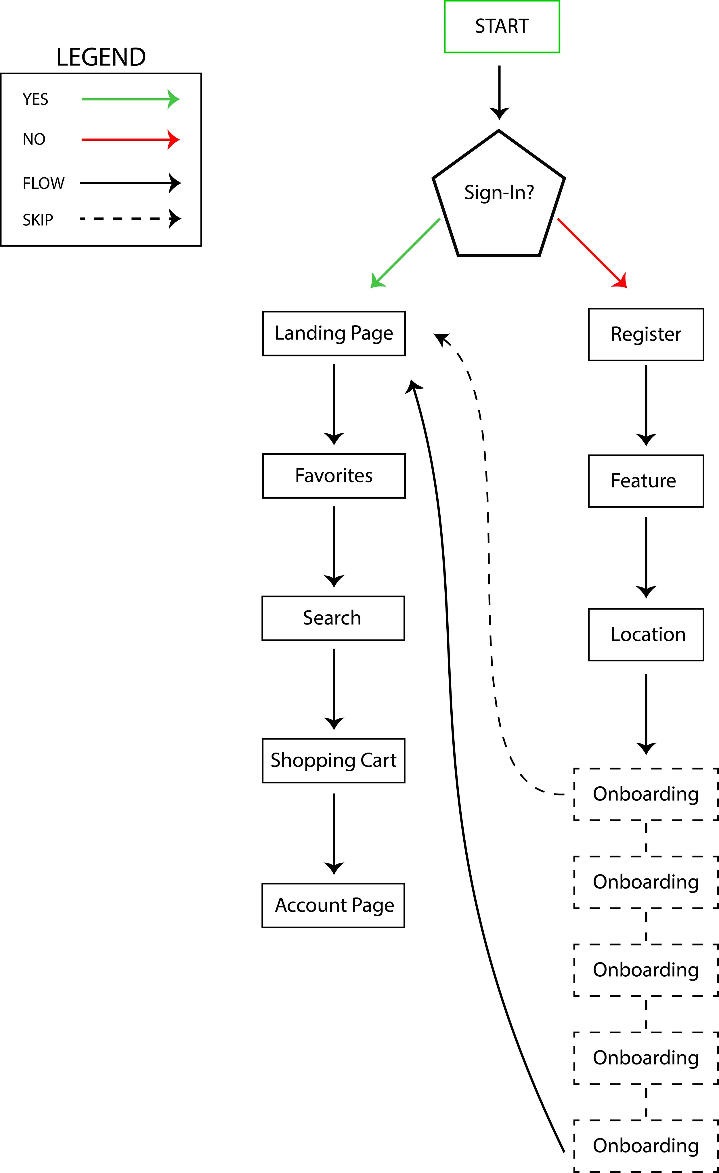

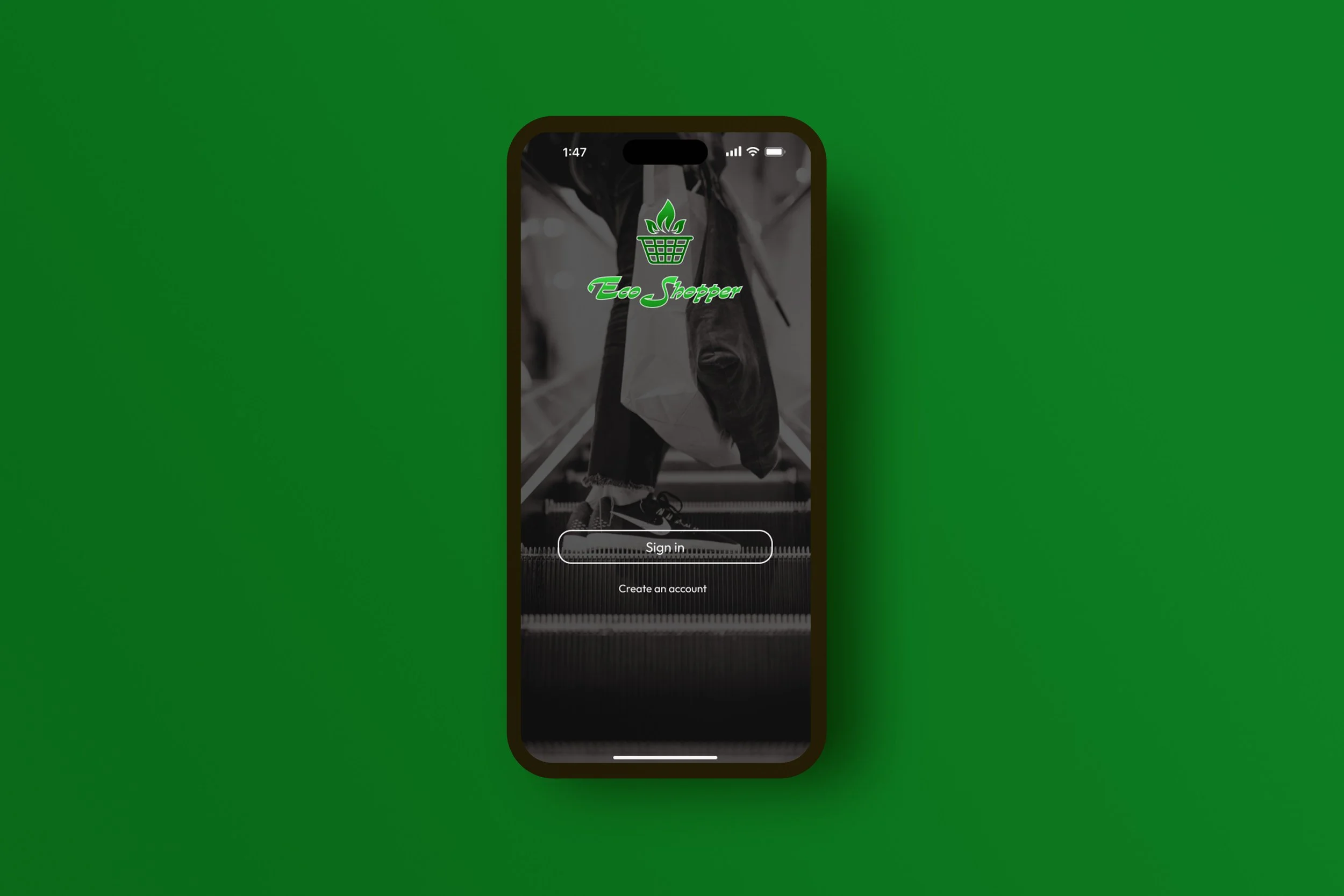
Click the image to view prototype

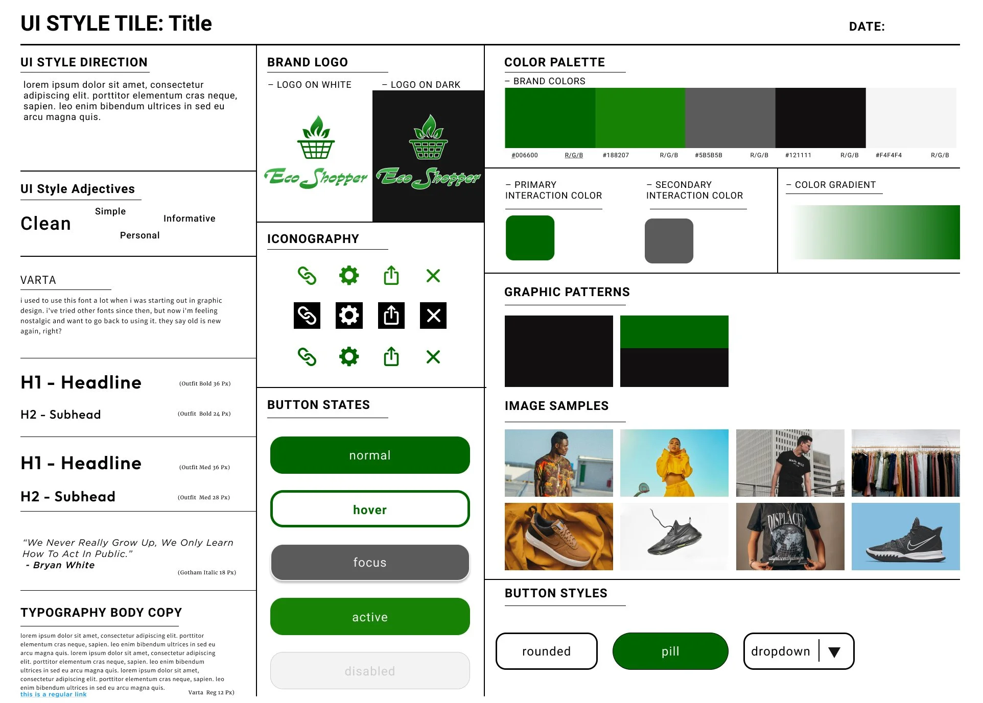
The web design team was responsible for this part of the project, and I collaborated closely with them to ensure a seamless transition from the mobile experience to the web. We used the mobile app as a starting point, carefully adapting its core design elements to fit the structure and behavior of the web. The goal was to create a consistent and intuitive user experience across both platforms, while also taking advantage of what the web uniquely offers. This process helped deepen my understanding of responsive design, cross-platform consistency, and the importance of aligning visual language with user expectations
