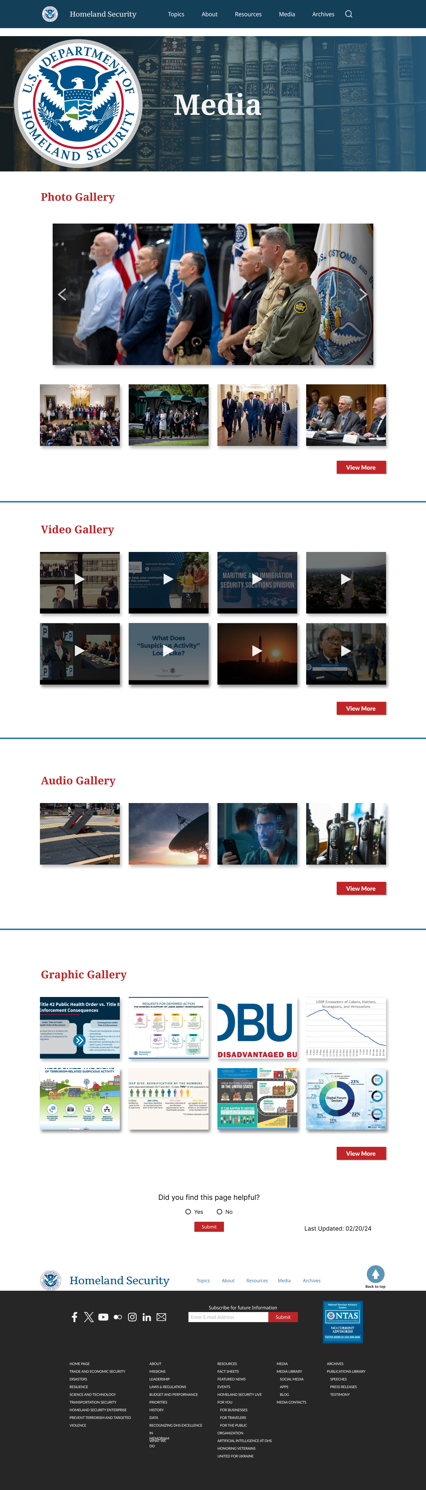


DHS.gov Responsive Redesign
Role
UI/UX Designer Lead Designer
Team
Anthony Rodriguez, Nicholas Lepe, Ricardo McFarlane
Duration
2 weeks
Tools Used:


Overview
Our objective was to redesign the Department of Homeland Security website, which serves as an information hub for new policies, bills, and the security of our country. Our aim was to create a more modern website that is easier to navigate and provides simpler ways for users to find the information they need.
The Problem
The original website was made to be just an information hub and a way to navigate to other organizations associated with the DHS. Users would want to know what updates and news the DHS gives the public.
The hero images and the slides are different sizes, and the information container got lost in the background images that they used.
The cards at the top of the page send users to different pages that are not on the DHS website. The news and information are at the bottom of the page. They are all colored text and not enticing to click on since the cards take the user's attention.
Design Process
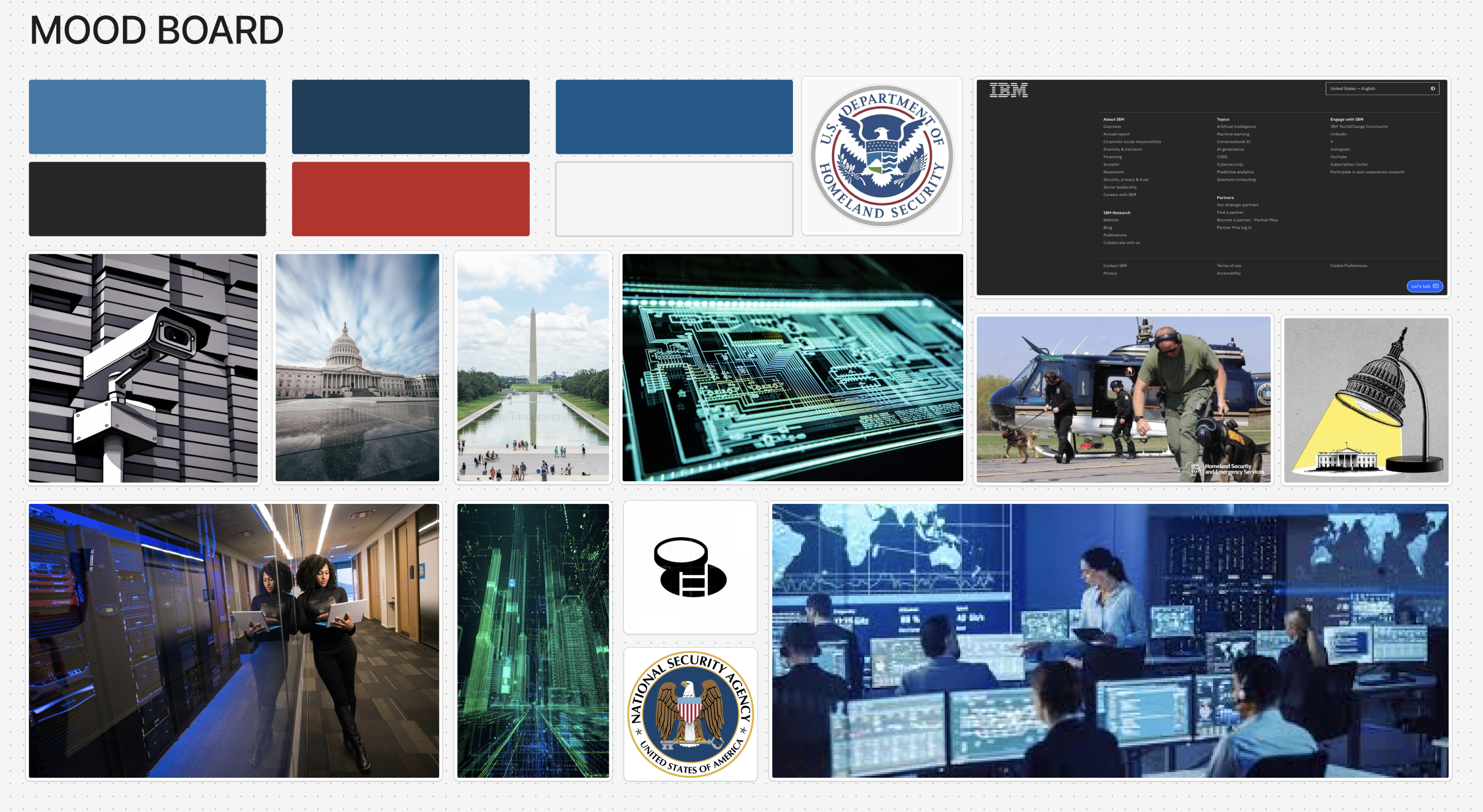
Upon reviewing the pages slated for redesign, I identified separate tasks for redesigning the Homepage, Media Page, and About DHS page. Drawing inspiration from the Australian defense agency, IBM, and the White House to understand website structure and color usage greatly influenced the final design.
We didn’t conduct interviews during this project, which was different and a blocker—having limited time held us back from that process.
Card sorting, writing two personas(employee and general user), creating a style tile, and mood boarding helped us in this process since we couldn’t conduct proper interviews to understand what users would want from a government website.